Most of the product designers, such as Matali Crasset and Ding 3000 studio were circling around the idea of the multifunctional and convertible object that reflects the fact that life is always changing - a chair that turns into a table, a coaster for a small pot that flips and turns into a coaster for a big pot that looks very different are just a few of the objects mentioned. Even Johanna Agerman Ross, who is the creator of the new biannual magazine Disegno, talked about this idea of the double-purpose object. I loved Ding 3000's ideas about humor in design. I do believe that people should have fun and it's a good way to bring some designers back to Earth, since there are a few out there who take themselves way too seriously. The "Dividing the Cake" cake mold was one of my favorite objects stemming from the idea of humor in design. It has different size pieces because some people want a smaller piece and some want a bigger piece, and it's just not practical to cut a cake in pieces that are the same size:).

Photo by Ding 3000: S-XL Cake

Photo by Ding 3000: INENDOUT Coaster
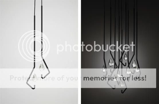
I enjoyed Thomas Feichtner's design of a crystal chandelier and wine glasses.

Photo: thomasfeichtner.com
David Pearson's lecture on book design and book covers was refreshing, funny and full of great visuals, and it was one of my favorites from today, since I just love books. Head over to his website by clicking on his name in the previous sentence and make sure you browse around, because there are some great book covers there. After him, Gerard Saint from Big Active took us to the world of design for the music industry, and I was very excited to find out that Big Active worked on Keane's Under the Iron Sea visuals, which are usually on every blogger's list of great CD covers.
Book Cover Designs by David Pearson


Photos: davidpearsondesign.com
Keane - Under the Iron Sea

Photo: bigactive.com
There were so many great ideas and products that were presented today that it's impossible to put them all down in a blog post, but I hope that the ones I've mentioned would still be inspiring for you and will give you a taste of what the first day of the seminar was like! I'm sooo looking forward to Day 2!


No comments:
Post a Comment