Sunday, December 20, 2009

GREAT BOOK COVERS


OK, I admit. I am a book-lover. I am addicted to books.

I can, and I do, read everywhere – on the bus, on the plane, while waiting in line, in bed, on the computer, during my lunch break. I go kind of nuts when I have finished a book and I don’t have anything new that I would like to read. It’s crazy, I know.


Seeing as I am also crazy about design, the amount of time I spend in bookstores is getting close to ridiculous. I look at the actual content of the books for about 70% of the time, and then I spend the remaining 30% oohing and aahing at some gorgeously designed book cover. While it’s true that it is the content that really counts, if a reader doesn’t actually pick up and open a particular book, the amazing story that is hiding inside will never be appreciated like it should. Besides, it is fantastic to have the satisfaction of holding an altogether great product in your hands, one that is beautiful both inside and out.

So below is a small selection of what I think are great book covers, one s that speak for the stories inside and compliment them. These were ones that made me do the mentioned above oohing and aahing or that have just screamed at me “come buy this book!” from across the bookstore.

Of course, I don't claim that these are the best out there or the only ones that are good. This is not an exhaustive list; it's just a small collections of covers I like. For more, check out the useful links at the end of the post. Also, here is a disclaimer: all posted covers are copyright to their respective holders.

1. Book: Shiver by Maggie Stiefvater, Cover art and design: Christopher Stengel

Photobucket

This is, hands down, one of the most gorgeous book covers I’ve seen lately. It is so in tune with the mood of the book that I get goose bumps by just looking at it. Just like the author’s prose, it is lyrical and poetic without being overly ornamental. If I ever write and publish a book, I want its cover to be this wonderful.

2. Book: The Book of Lost Things by John Connolly, Cover art and design: Robert Ryan

Photobucket


This one is also a big favorite. I love Rob Ryan’s papercuts. Once again, the cover image reflects the tone of the book really well with its fairy tale look and ominous overtones.

3. Book: Everything is Illuminated and Extremely Loud and Incredibly Close by Jonathan Safran Foer, Cover art and design: Jon Gray

Photobucket Photobucket


These are just plain cool. Sometimes working just with words and typefaces can produce a great result.

4. Book: Jonathan Livingston Seagull by Richard Bach, Cover design: Tom Bean, Cover image: Russell Munson

Photobucket


This one is actually not new at all, but it is timeless. It is a proof of the beauty of simplicity.


5. Book: Dandelion Wine by Ray Bradbury, Cover design: David Wardle

Photobucket

6. Book: Marcelo in the Real World by Francisco X. Stork, Cover design: Christopher Stengel

Photobucket

This is another Christopher Stengel. I guess he's pretty great.


Oh, and here are some useful links about the designers mentioned in this post and about book cover design in general:

David Wardle
Rob Ryan's Blog
Jon Gray
Fwis Covers
Book Cover Archive
Chip Kidd's official website
Cover Browser


Monday, December 14, 2009

HANDMADE EARRINGS

I love handmade things. There are a few small art shops around Sofia that sell all kinds of handmade things – plates, mugs, candles, scarves – and I just love to browse their shelves for hidden treasures. I especially love handmade jewelry. It is interesting and unique, and I always get compliments when I’m wearing something like that. You can see some of my favorites from my collection in the pictures below (from left to right: earrings made out of wire, earrings made with peony petals, and handmade silver rings and earrings):

Photobucket Photobucket Photobucket

Of course, I can’t always find exactly what I’m looking for, so at one point I started making my own jewelry. I have made a bunch of earrings and a couple of necklaces, examples of which you can see below:


Photobucket Photobucket

Just this past week, I filled an order I had for two pairs of earrings. The order was for one pair of “black earrings that can be worn with a dress” and one pair of “kind of crazy blue and green earrings.” The black earrings were easy enough in terms of the design, even if they weren't so easy in terms of execution:

Photobucket

However, I had no idea what to do for the “kind of crazy blue and green earrings.” I decided just to browse the shelves of a couple of bead and art supply stores and wait for inspiration to strike. I got a bunch of different jewelry elements and some funky blue-green beads, but I was still wondering what to do with them. Then, I rummaged through my drawers and found some wooden jewelry elements that were leftovers from another project. I ended up painting the wooden elements in blues and greens and gluing the beads to them. I actually love the final product so much that I think I’m going to make something similar for myself (hopefully without gluing my fingers together this time).

Check out the earrings below:


A few days ago, I made another pair in a similar style, this time using grey and black beads of various shapes and sizes. While these have a more classic look because of the conservative color scheme, they are still interesting and unique:


I’m ready to make more, just say the word :).

Sunday, December 13, 2009

THE WALL MURAL: BIRDS FLYING HIGH, YOU KNOW HOW I FEEL

I have to admit that I been extremely lucky in some aspects of my life. For example, I have pretty awesome parents. When I came back to Bulgaria after studying abroad for four years, their extremely generous gift to me was a place of my own. Of course, that meant that I got the opportunity to go wild with the design and decoration, something that every artistically inclined person dreams about.

In reality, I can’t say that I really went wild: I didn’t use ten different colors for my walls, I didn’t choose eccentric furniture that nobody would ever sit on, and I didn’t put a fake leopard rug in the living room (thank heavens!). What I tried to do was to color coordinate and to work towards a clean and modern look, while adding creative touches here and there in order to keep the artistic feel of the place.


My pride and joy in that respect is the bedroom.


THE BEDROOM


My bedroom is on the top floor of the house, with one wall almost entirely taken up by glass doors leading to a terrace, which overlooks the city. There is another window on the southern wall, which has the most gorgeous view of the Vitosha Mountain. All in all, it’s an awesome space. I also wanted this to be the space that felt the most like me. Those of you who know me well would know what this means; for those of you who don’t, I’ll tell you one word: blue. Not only do I love the color blue, but every room that I have occupied in the last ten years or so has been decorated in blue. This time, I chose a light shade that went nicely with the scheme of lighter and darker shades of beige with chocolate brown accents that I had chosen for the rest of the apartment.


The Design


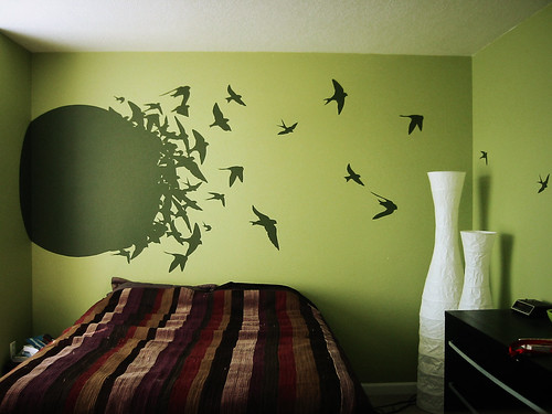
There is one peculiarity of the wall behind my bed. Due to the structure of the house, that wall is actually divided into two parts, with one part standing out more than the other. Most people would view that as a flaw, but I think that such “flaws” provide great opportunity to create something really unique. That’s when I came up with the idea of painting half of the wall light blue and having a light blue flock of birds coming out of it and flying into the light beige half of the wall. In the past year or so, birds have become something of a recurring theme in my art and photography. The image of a bird in flight conveys an amazing sense of freedom and movement, so the design seemed like a good choice for my bedroom.


Surfing around the internet for ideas, I looked at companies that produced wall decals. Even though I found some nice wall decals and stickers, they were ridiculously expensive and not in the color that I wanted. Then, I decided to browse through flickr, and I stumbled upon this photo of an awesome wall mural by Austin '81


Wall

The idea was very close to what I wanted, and I was very happy to read in the description of the photo that the people executed the whole thing all by themselves using stencils and having a lot of patience. I used some of the bird shapes from the photo for my design, adding others that I had drawn myself.


The Way to Do It


I was familiar with the idea of stenciling, but as I had never done it, I had to do a bit of reading on the technique. From my experience, however, only about half of the information and tips that you can read online on the subject are actually useful.


For example, most do-it-yourself websites suggested that I use cardboard stencils or stencils made out of thick transparent plastic sheet. In turn, I discovered that it was better to make them out of self-adhesive foil for several reasons:


1. You can find really cheap self-adhesive foil. Since it doesn’t matter what the color or the pattern of the foil is, you can buy whatever is on sale. In Bulgaria, you can find self-adhesive foil in most stores that have home improvement and construction products, and it is quite cheap.

2. Cutting stencils out of the soft thin foil is a lot easier than cutting cardboard or plastic sheets.

3. Self-adhesive foil stickers are very easy to stick to the wall, just like their name implies. Also, you won’t have to worry about the stencil moving and ruining your design in case you have to apply paint several times.


The self-adhesive foil idea was actually my dad’s, so a big shout out goes to him for suggesting it.


What You Need


What I ended up using for my project was the following:

- light blue and light beige paint
- self-adhesive foil
- craft knife

- small paint roller and small art brush

- lots of enthusiasm


Getting It Done


Armed with all the necessary materials, inspiration and patience, I followed the steps below:

1. I mapped out my design, taking into account the measurements of the wall. Based on that, I calculated the approximate dimensions of the different bird silhouettes and drew them on the self-adhesive foil.

2. I cut out the bird shapes using my craft knife. An important thing to remember is to cut on a cutting mat or other protective surface, so that you don’t destroy your furniture.

You should use the "negative" part of the self-adhesive foil cutouts for your stencil, which leaves you with the "positive" cutouts of the birds (see images below for the "positive" bird cutouts). If you like the color of the foil that you have chosen, you can play around and decorate something else with these birds.

Photobucket Photobucket

3. I placed the foil stencils to the wall as per my design. I made sure that the edges of the bird shapes had adhered well to the wall, so that there would be minimum leaks of paint once I start painting.

4. I used the paint roller to apply an even coat of paint and achieve a clean “silhouette” kind of look. It is best to apply the paint from the outside to the inside, so that the edges of the shapes stay clean and sharp.

5. I applied several more coats of paint until I was satisfied with the result.

6. I took the stencils down carefully, pulling diagonally. It is important to take the stencils down sooner rather than later, so that they don’t get really stuck to your wall (even though the danger of that happening is actually not very big).

7. I left the wall to dry for a day.

8. Since some bird shapes had to overlap in order to create the “flock” design, I had to repeat steps 3-6 over a couple of days until my design was done.

This is what my wall looked like at this point in the process. Some of the birds were stenciled already, but not all:


Photobucket

9. Finally, I used the small art brush to fix any leaks of paint or other minor flaws of the painted image.

You can see the finished wall below. I dare say it turned out great:)


Photobucket


To finalize the décor of my bedroom, I bought light blue curtains and light blue bed covers.
I also have these lovely sheets with a cloud pattern that go really well with the overall sky/birds theme. My mom suggested painting one of my laundry baskets in blue, which also turned out great. You can see some of these additional decor touches in the images below:

Photobucket Photobucket

OTHER IDEAS:

Other things that you can do:

- Paint a wall in a darker color, like dark blue, dark green, etc, and have a design in lighter color on top of it. If you match that with light furniture or a light rug on the floor, you’ll have one classy room.
- Stencil your ceiling. Imagine how cool it will be if you stencil the flock of birds on the ceiling and look at them first thing in the morning.
- If you want something funky for your children’s room, you can have them do handprints in different colors.
- If you have the money and you are not too picky about the color, you can get wall stencils. I have found some pretty awesome ones available online at the following addresses:
www.thesurfacestore.com

www.applepiedesign.be
www.miraentuinterior.com

Saturday, December 12, 2009

Добре дошли!


Photobucket

Добре дошли в Гнезденцето на КОСЕ-БОСЕ, дом на моите творчески идеи и седалище на KOSEBOSE Creative Designs.

Имало едно време една птичка на име Косе-Босе...е, всички знаете приказката, нали?

В България името Костадина често се съкращава на Косе, което веднага кара всички да се сетят за популярната народна приказка за Косето Босето. Разбира се, като малка много мразех този прякор, защото всеки разговор започваше с “Косе-Босе, дай ми едно яйчице.” По-късно, обаче, когато мислех да създам “персонален бранд” за себе си и творческата си работа, осъзнах, че вече имам перфектното решение: КОСЕ-БОСЕ! Името се знае от всички и се запомня лесно, използвала съм го откакто се помня и определено е забавно и закачливо. Подрасках си малко....и първото яйчице (или първата идея) се излюпи!

PhotobucketPhotobucket

Kosebose’s Nest е опит да сложа всички яйчица в една кошница, така да се каже – графичен дизайн, фотография, приложно изкуство и живопис, както и всичко, което ме вдъхновява. Връщайте се честичко тук и обещавам, че ще ви чакат много визуални лакомства.

Фразата “Косе-Босе, дай ми едно яйчице" придобива ново значение...:)

PS. Ще се опитам да поддържам този блог и на български, и на английски, но предварително моля за извинение, ако се окаже, че по-често пиша на английски.

Monday, November 30, 2009

KOSEBOSE'S NEST


Welcome to Kosebose’s Nest, the home of my creative ideas and the residence of KOSE-BOSE Creative Designs.

Once upon a time, there was a blackbird named Kose-Bose. The bird lived happily on a tree in the woods, taking care of her nest and eggs, until a sly fox started taking one egg at a time. Finally, Kose-Bose had only one egg left. The bird was sad; she didn’t want to lose that last hatchling. So on the next day, the bird told the fox that the egg was hidden in the bushes, knowing that a dog was waiting there. The dog chased the fox away, and Kosebose saved her egg and lived happily ever after.

In Bulgaria, the name Kostadina is usually shortened into Kose, which immediately makes people think of the popular folktale about the blackbird Kose-Bose. Of course, I hated it when I was little; every conversation started with “Kose-Bose, will you give me an egg?” However, when I was thinking of creating a personal brand for myself and my creative work, I realized that I already had the perfect solution: KOSE-BOSE! It’s well known, I’ve been using it for as long as I can remember, and it’s fun! I doodled a bit…and my first egg – or should I say my first idea – was hatched!


In Kosebose’s Nest, I will put all my eggs into one basket, so to speak – graphic design projects, photography, crafts, art, inspiration. Check back here often, and I promise that there will be fresh visual goodies waiting for you.

I guess that the phrase “Kose-Bose, give me an egg” takes on a whole new meaning!
Related Posts with Thumbnails