As promised, this post is about Sofia Breathes: Design, the conclusion of Sofia Design Week 2011. A true summer day, sunny and hot, this past Saturday was a perfect day to spend outside on Shishman Str. In fact, I think half of Sofia was there at one point or another, lounging on the sidewalk or in One More Bar, or otherwise strolling around, taking photos (just like I was), drinking a bottle of organic lemonade, playing Foosball, or looking through the stands and the posters with logo design projects for Sofia as an European Capital of Culture.
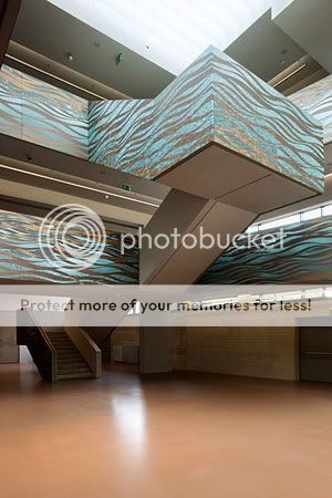
All electric transformer kiosks (or switchgear kiosks, or whatever these are called in English) were painted with different images and designs, which was probably my favorite part of Sofia Breathers, along with the window frames turned into white sculptures by studio Lumagi. Check out the photos below (I apologize for the deep shadows and bright areas, but it was around 3 in the afternoon when I shot these, and the light was far from optimal).
I'm loving the bird theme here (what a surprise..hehe) This one is also a favorite of mine. It's so summery! The one with the painting of the square in front of the National Theater is just plain awesome! That's also my favorite place in Sofia. Stands for clothes by independent designers: One of the Lumagi "windows" and a real window of The Gourmet House, which is still quite cool: The handmade paper workshop was a nice touch. It's good for kids to know how things are made!
Since I started yesterday's post about the first seminar day of Sofia Design Week with a small fashion review, I thought I'd continue the pattern and do this again today. Day 2 was the day of scarves and iPhones. You're bound to wonder why I'm referring to the iPhone as part of my so-called "fashion review," and my answer is that at this point I believe that for many people the iPhone is more of a fashion statement than anything else, or at least a kind of statement that doesn't have that much to do with functionality. Of course, from a design standpoint, the iPhone is a great choice, so I guess what I want to say is that I'm not judging but merely observing a trend. I loved all the scarves, of course, since I am a scarf person myself, and also the handmade earrings, again for the obvious reasons.
The seminar day started with a lecture by Michael Marriott, who talked about objects, what they mean, and the stories they tell. He talked about the idea that the way people put together objects tells an even more complex and rich story, which I found to be something that I can agree with. He talked about the poetry of the "misuse" of objects, or the beauty and humor that can be seen in the way people use objects outside of their original purpose - rubber boots as door stops, bottles as chairs, and so on.
The second lecture was focused on creating visual identities for companies and institutions and was presented by Walter Bohatsch and Julia Krauth from Bohatsch und Partner. The projects that they presented were great illustrations of excellent design that employs the grid system, careful selection of type, and very successful use of patterns that are especially created for their clients with the specific project in mind. Even the logos that they design are usually formed in such a way that they can be used and stacked to produce a pattern, which I thought was very interesting. I especially enjoyed their work on Schulzentrum Krems and Bad Radkersburg.
It's a pity that the website of Bohatsch und Partners doesn't work at the moment, but hopefully in the future you would be able to browse through and see all the work they did for the school center - from wallpaper through pictograms and maps to outdoor signage - as well as their work of other clients, such as the mountain resort Arlberg.
Krassen Krestev's lecture on the Bulgarian Cyrillic alphabet was definitely one of the high points of the day. Krassen is an excellent presenter, and his lecture was exciting both visually and intellectually. He presented some very interesting characteristics of the Bulgarian Cyrillic alphabet in comparison with the Russian Cyrillic and the Latin alphabets that I had never thought about before. It turns out that the Bulgarian Cyrillic alphabet is more readable and dynamic than its Russian counterpart, even if it is not as efficient in terms of the space it uses. A curious tidbit to learn was that the letter t, or "m" in the Bulgarian Cyrillic alphabet as compared to the "т" in the Russian Cyrillic alphabet, is the one that makes the text take up more space. The conclusion was that the Bulgarian Cyrillic alphabet has a strong identity that has to be protected by all of us; it is the kind of legacy that should not be left in the past.
Here is one of Krassen Krestev's fonts called DTL Paradox BG, which is an example of Bulgarian Cyrillic alphabet. Nelly Ben Hayoun's lecture about interactions design was so much fun, not only because of the projects themselves, but also because of the amazing enthusiasm of the artist. Nelly focuses on recreating thrilling experiences - seeing a volcano erupt in your living room, living through a liftoff into space by sitting on a special chair, experiencing a sonic boom in a balloon tunnel that mimics the Kamioka neutrino observatory.
"The Other Volcano" "Super K Sonic BOOOOum" Photos: www.nellyben.com
Dessislava Vardjieva-Eckhardt took us through some design projects that her students at the School of Visual Arts in Leipzig are working on, followed by the guys from Rich Brilliant Willing, who talked about some of their designs using ready-made components. They use off-the-shelf and ready-made parts to design their furniture and just tweak these components to create design objects. It was DIY turned into a design business, which I thought was a very nice idea.
The seminar concluded with a lecture by Konstantin Grcic that contained lots of images of chairs:). It was a nice overview of the evolution, or rather the life and variety, of chairs throughout the years, followed by some of his designs of chairs.
All in all, this was definitely a great, informative, and fun day of design lectures. Still, Sofia Design Week is just beginning, so there's lots more to see in the coming week. I am also looking forward to its conclusion next Saturday with a "Sofia Breathes" day of design workshops on Shishman Street, which will be closed for traffic. See you all then!
Day 1 of this year's Sofia Design Week Seminar was cloudy and cold, but that did not stop it from being quite interesting and exciting. It was a day of cool bags and Converse sneakers, as I think that for the most part everyone from the audience was wearing one or the other, or sometimes both. Seriously, the number of great bags I saw today was staggering; even the guys had very cool bags. The Converse sneakers definitely seem to be back in style among creatives, although this makes me wonder whether I can count myself as a creative person if I don't actually own a pair...the thought is worrying:) Anyway, I guess it was fitting, since the cherry of the cake in the first seminar day was actually an awesome interactive campaign that the studio Perfect Fools has created for none other than, yes, Converse! Check out just one of the videos featuring the Converse screen of sneakers, where each sneaker is a pixel:
Most of the product designers, such as Matali Crasset and Ding 3000 studio were circling around the idea of the multifunctional and convertible object that reflects the fact that life is always changing - a chair that turns into a table, a coaster for a small pot that flips and turns into a coaster for a big pot that looks very different are just a few of the objects mentioned. Even Johanna Agerman Ross, who is the creator of the new biannual magazine Disegno, talked about this idea of the double-purpose object. I loved Ding 3000's ideas about humor in design. I do believe that people should have fun and it's a good way to bring some designers back to Earth, since there are a few out there who take themselves way too seriously. The "Dividing the Cake" cake mold was one of my favorite objects stemming from the idea of humor in design. It has different size pieces because some people want a smaller piece and some want a bigger piece, and it's just not practical to cut a cake in pieces that are the same size:). Photo by Ding 3000: S-XL Cake
Photo by Ding 3000: INENDOUT Coaster
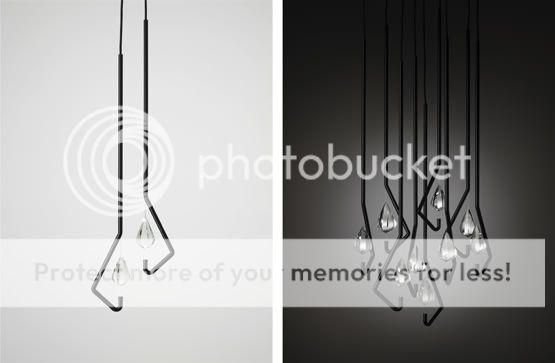
I enjoyed Thomas Feichtner's design of a crystal chandelier and wine glasses.
Photo: thomasfeichtner.com
David Pearson's lecture on book design and book covers was refreshing, funny and full of great visuals, and it was one of my favorites from today, since I just love books. Head over to his website by clicking on his name in the previous sentence and make sure you browse around, because there are some great book covers there. After him, Gerard Saint from Big Active took us to the world of design for the music industry, and I was very excited to find out that Big Active worked on Keane's Under the Iron Sea visuals, which are usually on every blogger's list of great CD covers.
Book Cover Designs by David Pearson Photos: davidpearsondesign.com
Keane - Under the Iron Sea Photo: bigactive.com
There were so many great ideas and products that were presented today that it's impossible to put them all down in a blog post, but I hope that the ones I've mentioned would still be inspiring for you and will give you a taste of what the first day of the seminar was like! I'm sooo looking forward to Day 2!
I've had a hectic past two weeks. Believe it or not, I had to work for 10 straight days because we were organizing several events at the ad agency I work for. I'm all rested now, though, because I took a few days off to go on a mini SPA vacation and soak my tired self in some mineral water springs. But enough with my rambling :) One of the events I was working on was the "Celebration in the Park," an event for kids in one of the parks in Sofia, which featured concerts, dance, painting and sports workshops, chalk art contests, bike races, and, of course, free balloons for everyone! It was so much fun seeing and photographing all the incredibly cute kids! Also, check out the incredible dance jump photo I managed to snap below! These two photos of the chalk are like an exercise in depth of field...haha:) Just look at this little guy with the cool shades! This gorgeous couple teaching the kids how to dance salsa is the team from PaLante Dance Project, where I dance in my free time: http://www.palante.eu/