Tuesday, July 29, 2014

Stardust Original Artwork

I love giving red paintings as gifts to friends because they are vibrant and full of life, but last week I decided to break out of this tradition. This time when I decided to paint something as a birthday gift for a friend, I thought I would do a piece in dark blue. I kept picturing something fresh and crisp, with a sort of "starry quality," which I ended up calling "Stardust." It has a new home now, and I hope its new owner likes it.

Also, stay tuned for more artwork news from me. Just last week I finished my first big commissioned work, which is now drying and waiting to be shipped. Fingers crossed that everything will be fine! I will post the image once I mail the canvas.

So here is "Stardust":


Monday, July 21, 2014

One Design Week 2014: Forum Highlights

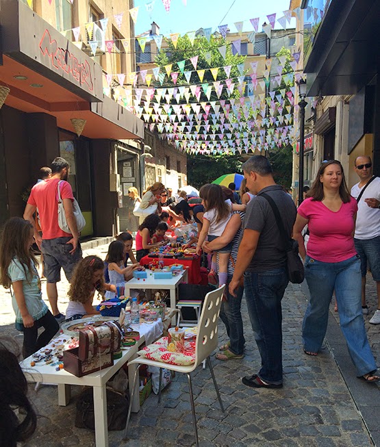
Fashion fact of the day: the dress code for this year's One Design Forum was graphic pants and scarves. From years of observation it seems to me that designers and various creative people love scarves, so every year you can see a wide variety of them at the Forum. I think that next year I might do a Fashion @ Design week blog post where I would photograph every person wearing a scarf. It will be like my own little scarf directory.


But let's talk more about the lecturers at the event, not only about the accessories of the audience. I can’t deny that the Forum is my favorite part of Design Week, and every year I look forward to that one or two days of creative ideas. This year, just like some of the previous years, I will write about some of the highlights that I enjoyed and found interesting.

I have always loved tinkering with fonts, for example. Back in high school, I always ended up using some new free font I had found online for my presentations and assignments. I think I was a bit of a design geek back then (and probably still am), and I used every opportunity I got to have fun with fonts. Perhaps this is why I really enjoyed the lecture by TypeTogether, a type foundry by Jose Scaglione from Argentina and Veronika Burian from Prague.


The studio is focused on creating fonts for longer texts, to be used in newspapers, books and magazines, for example, as well as creating fonts that can look good no matter what the quality of the paper or printing is. Some of their well-known fonts are Bree, Adelle, Abril, and Tablet Gothic. For me it was very useful to hear about the challenges that designers face when creating fonts to be printed on bad paper (like newspapers), so that the letters remain legible and with character. It is amazing what a difference of a part of a millimeter in a letter can make when we are talking about fonts and their readability; font creators work on a small scale to create a big impact in terms of how a text is perceived. I have played around with the idea of creating my own font, but I don’t feel competent enough to do it yet. However, this lecture was a step forward. It also pleased the geek in me immensely :)


Another lecture that I found engaging was that by Sven Ehmann from the publishing house 
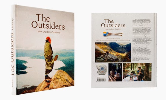
Gestalten.  The publisher concentrates on books about cutting-edge visual culture, and as such, its creative director works to set the overall direction of the company’s work, as well as to come up with new topics for books and to decide what projects would go into those books to make them interesting and exciting for the reader. One of Gestalten’s latest books is The Outsiders, which deals with the “refreshing and evolving ethos of today’s smartly successful outdoor and lifestyle entrepreneurs and features interviews with key players from across the outdoor sector.”


The book features a wide variety of points of view on the subject of doing something outside; it is a collection of cool products, interesting outdoor living and apparel companies, new trends in outdoor sports and experiences, beautiful photos and illustrations, acting as an inspiration to those interested in the lifestyle. Head over to Gestalten’s website http://shop.gestalten.com/ to browse through their book collection.

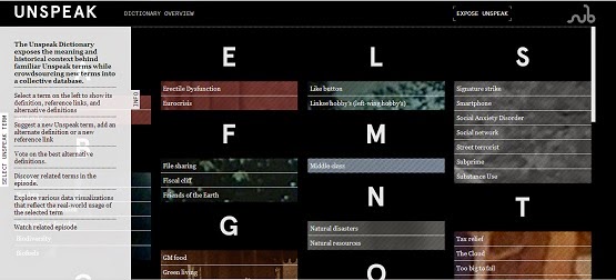
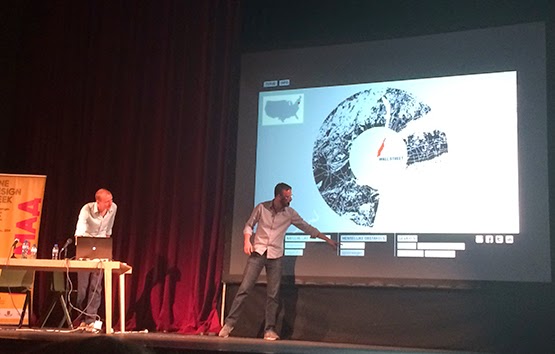
I was also fascinated by the lecture on information design by Catalogtree, a Dutch design studio that specializes in infographics. Information design is such a specific branch of design, and it requires a particular way of thinking, as well as a talent to distill complex trends and data sets into clear and exciting visual images. Not everyone can do that and have such talents, but it seemed to me that the Catalogtree team was quite good at it. I enjoyed hearing about their part in visualizing data for a documentary about trading called "Money & Speed: Inside the Black Box." Also, I liked the Unspeak project that they worked on, which explores how language can manipulate our understanding of events, based on a book by Steven Poole. You can see the project at the following link: http://unspeak.submarinechannel.com/dictionary/.


Several interesting ideas were presented by design duo Studio Swine, who like to travel, but also to recycle, which ultimately leads to culture-specific ecological projects that have the potential to help anyone create design objects out of trash or waste. An issue that they tried to tackle, for example, was plastic waste in the sea that is bad for the fauna and for the fishermen. They devised a little portable furnace and molds that help fishermen made little stools out of the plastic that they catch in their nets. You can see the video below:


Sea Chair from Studio Swine on Vimeo.

Head over to their website http://www.studioswine.com/projects for more projects like this one.

Theodore Ushev showed some great posters from his portfolio, but I really didn’t like how bitter he sounded about everything. Oh, poor graphic designers, selling their work to clients with no taste like hookers sell their bodies, how awful (pretty much what his opinion was). I mean, enough already. It’s a business like any other, and most graphic designers are pretty far from being the misunderstood geniuses that they think they are. It’s a bit of a cliché, the idea of the designer who is so amazing, but who is forced by evil clients to produce ugly projects. Sure, I know from my own experience that you have to make some compromises when working commercially in order to please the client, but I think that if you are such an amazing designer, you will find a way to produce something great even when the client wants something that you don’t agree with. Then again, Mr. Ushev will probably say I am young and naïve :) Although, don’t constraints usually make people look at things in a fresh and new way?

Anyway, Theodore Ushev is now best known for his animated shorts, and you can see some of them here https://www.nfb.ca/explore-all-directors/theodore-ushev

Finally, despite my initial misgivings, I did enjoy Jessica Walsh’s lecture on advertising design and her personal projects. The Forum booklet description of her started with the fact that she is young and beautiful, so you should excuse my reluctance to take her seriously at first. However, she was a pleasant surprise. I enjoyed her presentation, which had to do with work and play, and how these two concepts should go hand in hand when you are a designer and/or you work in advertising (and in at least a couple of other spheres as well, probably). She is quite the gutsy young woman, not afraid to put herself out there (naked or not) and do some crazy stuff or turn her relationship attempt into a web/design/blog project (see 40 Days of Dating). By the way, her 40 Days of Dating project will be made into a movie, which lead me and some designers I was with at the Forum with to have a discussion about how it is very important to be at the right place at the right time. If someone makes a project like that one in Bulgaria, people might notice and talk about it, and some TV shows might invite you to speak, but it will probably end there. If you do the same in the US, however, you get on the Today show and then Hollywood comes knocking, buying the rights to your life story for millions of dollars. Location, location, location!

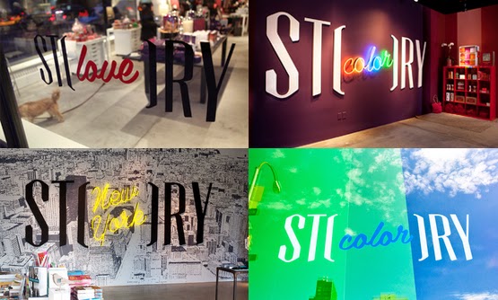
Anyway, I liked some of the work projects that Jessica showed us, such as logo design for a shop called "Story", which changes its theme and decor every six weeks, the Levi’s "We are all workers" billboard, and their overall work on the Aishti and Aizone brands.


We Are All Workers - Levi's Gears Billboard from Satellite Office on Vimeo.


Aizone, Spring Summer 13, Behind the scenes from Sagmeister & Walsh on Vimeo.


Aizone FW13 Behind the Scenes from Sagmeister & Walsh on Vimeo.

One interesting thing that she said was the fact that they only present one idea to the client when they make a pitch, which is very unusual in advertising. Back when I worked in CAS, we always presented the client with more than one idea, I guess both as insurance that if a client really doesn’t like our first idea, we have backups and as a proof that we have put a lot of effort in working on their brief. However, Jessica explained (and I tend to agree with her when I think about it) that when the client sees a couple of things, they usually end up wanting to take one element from one campaign, another from a second campaign and so on, making the final design look like a Frankenstein of sorts, all patched up together and not quite working.


Jessica Walsh from Like Knows Like on Vimeo.

I’ll end this post on this note: it would be great if all of us could find something to do where work=play. Sometimes that works for me, sometimes I can’t manage to do it. How about you?


Tuesday, July 8, 2014

One Design Week 2014 - Design Bazaar

Every year the Design Bazaar at the end of One Design Week becomes better and better. This year there was some phenomenal stuff by local artists and designers working in Plovdiv, as well as by some design studios from Sofia. I ended up spending quite a lot of money there, but it was all worth it, I think. I love having handmade stuff, and I also love giving handmade objects as gifts. I think that it is very nice to know that you've been given something that's one of a kind. I have always loved handmade jewelry as well, so I ended up getting a couple of items from a very cute local shop, which was not really a part of the bazaar but had interesting stuff all the same. Since brooches are my new thing, I got an earrings and brooch set in beige and green, as well as a bird brooch (I am obsessed with birds, yes).


So here are some highlights from my design shopping experience:

Piron 
http://pirondesign.com/bg/

This was by far my favorite booth at the bazaar, and I ended up purchasing one of these flower trays for my mom. The trays and coasters on the photo are made of pressed flowers covered in transparent resin with a wooden frame and beautiful decorative handles. They have such a rustic charm, and they were so fresh and lovely that I couldn't resist getting the one with the purple and yellow flowers on the photo below.


HandДжоб
http://www.handdjob.net/
http://knitrebel.blogspot.com/

The way I first got introduced to this interesting brand was by standing in line to get a croissant at the One Design Week Forum breakfast bar, and I saw that the girl in front of me had this really cool leather bag with a funny tag saying HandДжоб on its little pocket. I thought that the name was quite clever and funny, so I looked it up online, and I decided that I might buy a bag once I get back to Sofia. To my pleasant surprise, the designer had a booth at the bazaar, so I bought a bag there! It's the red one form the photo below.


evgeniya tsancova contemporary jewellery 
http://evgeniyatsancova.blogspot.com/

This jewelry designer makes really cool necklaces, bracelets and rings of knotted cords or laces (not sure what to call them). Head over to her blog for some more designs.


Photos from http://evgeniyatsancova.blogspot.com/

I also bought a very cute "KoseBose" mug (meaning it has a cute birdie) and a very vintagy black-and-white polka dot brooch that I can't wait to wear. They are by artist Albena Djokova (https://www.facebook.com/AlbenaDjokova) Here they are:


There was much more to see at the bazaar, of course, and also in the Kapana neighborhood, but I can't possibly write about it all. Here are some other interesting shops, designers and their work:
https://www.facebook.com/find.ser/
https://www.facebook.com/whatamonstar
http://viktorpavlov.jimdo.com/
https://www.facebook.com/Rakodelnicata
http://malukindian.blogspot.com/
https://www.facebook.com/pages/yana-tankovska-design/236167473120229

And just a few words about Cable Lovers: awesome light fixtures! Both retro and modern, and very interesting! Check them out here: http://cablelovers.com/en/

Photo from http://cablelovers.com/en/


Thursday, July 3, 2014

One Design Week 2014 - Kapana Logo Deisgn Contest

Those of you who have followed my blog over the years know that I am quite the fan of Sofia Design Week, and I try to attend the forum every year if I can. This year, to my surprise, Sofia Design Week became One Design Week (named after the organizers, One) and was moved to the city of Plovdiv. At first I was annoyed. How dare they move my favorite event of the year to another city!? What are they thinking!? What insolence! I wasn't even sure that I would be able to go at all if a work thing came up for that weekend. 

But then I sort of liked the idea. True, I couldn't spend a full week in Plovdiv browsing the design exhibitions and attending various events, but I had quite a lot of fun taking a weekend to roam the streets and galleries of this charming city. I spend most of Saturday at the Forum, which I will talk about in a separate post, as usual, but I spent my brakes visiting the nearby design shows, walking along the pedestrian zone and enjoying some parmigiano, sun-dried tomatoes, sausages, and canolli at an Italian food fair in downtown Plovdiv. 


Walking along the pedestrian zone, I also had the chance to look at the logo designs of the finalists in the Absolut Kapana logo design contest. For those of you who don't know, Kapana is a 19th century neighborhood in downtown Plovdiv, which used to house various worksmiths, but has at the edge of oblivion as a cultural playground in the past few years. Now the manucipality of Plovdiv is trying to revive the area as an artistic meeting place, and ABSOLUT joined in the fun by organizing a contest to find a new symbol for Kapana, focusing both on its past and on its artistic future. You can read more about the contest on its official website www.absolutkapana.bg

I snapped a few photos of the entries of the finalists (not all of them) with my phone, which I have posted below with a short commentary for each one. Unfortunately, the logo that I liked best (and even those I liked almost as much as that) was not the winner. I am sure that there will be people who don't agree with my opinions, asking who am I to critisize the work of others. Oh well. They'll have to deal with it. After all, these are just my humble opinions:) 

Let me start by talking about my favorite logo. Perhaps it is not all that minimalistic as is the trend in logo design lately, but it captured my attention right away, which is what a logo should be doing in the first place. I think that this logo carries a certain feeling of mysticism that is inherent in the Kapana area, and it does a great job of conveying the uniqueness of the traditional Bulgarian architecture of the Revival in a modern way, without having too many unnecessary details. Also, I think that the origami-like structure (see the tshirt) that is made to resemble the map of the area gives the design an artistic, DIY, craftsy look that I like very much. 


Photo from http://www.absolutkapana.bg/ 


This next logo is nice and colorful, but for me it fell just short of being original, perhaps because I think I have seen a million other logos with the same bright colors and angular shapes online and in stock vector websites. It is visually pleasing, and I do like the design of the bag, but otherwise I felt it was too generic for Kapana. 


I liked this next logo by Elena Kalpakchieva reminds me of the Hudertwasserhaus in Vienna, which is both a good thing and a bad thing. It is good because the logo conveys a sense of cultural richness and the uniqueness of the location with its colors and building shapes, but at the same time it is bad because, well, it evokes the Hudertwasserhaus, which is nowhere near Plovdiv. But perhaps that's just me.


The logo by Boris Bratkov is another favorite of mine, even if it is probably the most abstract in the selection. To me it seems like it is also loosely based on the map of Kapana, and also emphasizes its desired status as a meeting point for diverse artists. Furthermore, I can see a certain letter K shape in the lattice of objects in the logo, which reminds me of the name of the neighborhood. If you go to the contest website and leaf through the finalist booklet, you can also see some other applications of the logo that the designer has presented in terms of themes (astronomy, typography, etc.) that I really liked.


The following logo is very focused on the letter K, and even though the designer explains that it is constructed of architectural shapes typical for the neighborhood, I can’t help but be focused entirely on the K shape. If anything, to me the letter looks like a chair. I guess that there is always a risk when you create a design that can take on lots of shapes depending on how you view it: there is always someone who sees something that you didn’t mean them to see.


This next logo looked interesting to me, and I think that the funnel shape does play into the idea of a “trap,” which is the meaning of the word “Kapana.” It looks like something you fall into and might not be able to or want to get out of. However, you could also argue that it looks like a colorful iceberg or icicle.


The next design by Stoyan Hristov plays with the same means of expression like the logo by Elena Kalpakchieva that I discussed above. I find this design by Stoyan Hristov more appealing, however. There is a certain art deco feel about the typography and colors, though, which does not entirely correspond to the architecture of the area. Still, I think this design was one of my favorites.


Apart from being visually pleasing in its triangular shape, the next logo by Ilia Gruev didn’t seem like it had much to do with the past, present or future of the Kapana area, but that might be just my opinion. The design resembles that of skater apparel, which is nice, but also limits its appeal if we want to real a wider audience. When I read the short description that the designer submitted, I had to agree that he did play around with the idea of a crossroads, but I have to admit that I didn't see that when I first looked at it. Perhaps we are all too jaded by the commercial designs we see each day, and it is hard to look at images without putting them in the context of your own experience.


I did enjoy the design by the team of Mila Ivanova, Tsvetomir Pavlov, and Vassil Krustev, but I do wish that there were options in color. The logo is constructed in such a way as to demand applications in black and white, but I feel like we would lose something of the artistic feel of the neighborhood if we don’t have any color. After I came back to Sofia, I browsed through the contest website, and I saw that they did, indeed, offer an option in color. However, I still felt like there was something small that was missing.


At first glance I found the next logo quite charming: it has a vintage feel and could be viewed as a sort of artistic compass. However, on second thought I decided that while it was pleasing and beautiful, it was too focused on the past and on the specific architectural element of wrought iron and other decorative elements from iron. The designers noticed these elements in Kapana, but I missed them.


The design by Mariska Ferket is decidedly minimalistic, but adds visual interest through colorful patterns, textures, and other graphic elements. Somehow, though, it is only vaguely connected to the atmosphere of Kapana by its shape, taken from the letter K. Looking at the logo, I would guess that it had something to do with design and creativity, but definitely not that it represented the Kapana neighborhood in Plovdiv.


And finally, the winner. It is a good design, constructed out of the letters of the name Kapana and stylized into a square; it is both open, closed, minimalistic and expressive. What I didn’t necessarily like about it was the associations with the art of Mondrian that it brought in me, not because I don’t like Mondrian (which I do), but because Mondrian and Kapana in my mind do not invoke the same feeling and meaning. At the same time, I do agree that the execution is smart and fresh, so even if it is not my absolute favorite design, I definitely see its potential to work wonderfully as a logo for Kapana that is modern, clean, and focused on the future. 
Photo from http://www.absolutkapana.bg/ 

For those of you who didn’t get the chance to be at One Design Week in Plovdiv and look at the design entries in the contest, I do urge you to browse through the official website and check out the explanations of the artists that accompany their design submissions. I always find it very refreshing and enlightening to see the thought and work process of other creatives. Head over to www.absolutkapana.bg And enjoy! 


Disclaimer: No copyright infringement is intended.
Related Posts with Thumbnails